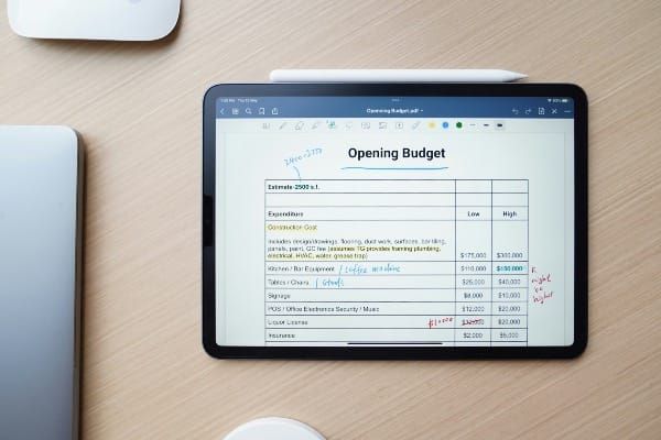
How to Build a KPI Dashboard for Local Government in PowerBI

Local government departments generate enormous amounts of data every day — call logs, billing records, service requests, financial transactions, and more. The challenge is not collecting that data. The challenge is presenting it in a way that actually drives decisions.
This guide walks through how to build a KPI dashboard for local government using PowerBI Desktop — the free version of Microsoft's analytics platform — with practical examples drawn from real government call center operations.
Why PowerBI Desktop for Local Government?
Before diving into the build, it is worth addressing a question that comes up in almost every government department considering PowerBI: Desktop or Service?
For most local government teams the answer is PowerBI Desktop — and the reason is straightforward. PowerBI Service requires a Pro license for every user who needs to view published reports. In budget constrained government environments where departments are sharing tools across dozens of staff members, licensing costs add up quickly and create access barriers that undermine the entire purpose of building a dashboard in the first place.
PowerBI Desktop is completely free to download and use. Dashboards built in Desktop can be shared as files, exported to PDF, or published selectively through a gateway connected to your ERP system for teams that do have Pro access. For the majority of local government use cases, Desktop is the practical and cost effective choice.
Note for Mac users: PowerBI Desktop is a Windows only application. Mac users will need to run it through a virtual machine such as Parallels, or use PowerBI Service in a browser as an alternative.
The Two Biggest Dashboard Mistakes in Local Government
Before building anything, it is worth understanding why so many government dashboards fail to get used after the initial launch. In practice there are two mistakes that account for the majority of underperforming dashboards.
The first is including metrics that do not matter. Every dashboard should answer a specific question that someone in the department is actually using to make decisions. If a metric is not influencing any decision — staffing, budgeting, process improvement, or performance management — it has no place on the dashboard. Including it anyway creates noise that obscures the metrics that do matter.
The second is presenting unorganized and overwhelming information. A dashboard that tries to show everything ends up communicating nothing. When a department director or non technical staff member opens a report and sees twenty charts competing for attention, the instinct is to close it. The goal is immediate clarity — a viewer should understand the key message of each dashboard page within ten seconds of opening it.
Both mistakes share the same root cause: building dashboards for the person who created them rather than for the person who has to use them every day.
Understanding Your Raw Data Before You Build
Your call platform does not export pre-aggregated metrics. It exports raw transactional records — one row per call. Every KPI you display on your dashboard has to be derived from that raw data using PowerBI's calculation engine. Understanding this distinction before you build saves hours of frustration and produces a far more flexible and accurate dashboard.
A typical call platform export for a local government call center contains columns similar to these:
- Call ID — a unique identifier for every individual call
- Date — the calendar date the call occurred
- Time — the timestamp of when the call was received
- Day of Week — useful for weekly pattern analysis
- Half Hour Interval — the 30 minute window the call fell within, for example 9:00–9:30 AM
- Call Duration (seconds) — total length of the call from answer to disconnect
- Hold Time (seconds) — time the caller waited before being answered
- Talk Time (seconds) — time spent speaking with an agent
- Answered — a Yes or No field indicating whether the call was answered or abandoned
- Abandon Time (seconds) — how long the caller waited before hanging up on an unanswered call
- Agent ID — identifies which agent handled the call
- Department — the department or queue the call was routed to
- Call Type — the category of inquiry such as billing, service request, or general information
This raw structure is your foundation. Every metric on your dashboard is a calculation built on top of these columns — not a number you type in manually.
Building Your KPIs as DAX Measures
Once your raw data is loaded into PowerBI, your KPIs are created as DAX measures — PowerBI's formula language for calculated fields. Here are the core measures for a local government call center dashboard:
Total Calls Count of distinct Call IDs across your selected time period. In DAX: Total Calls = DISTINCTCOUNT('CallData'[Call ID])
This is your baseline demand metric. Every other KPI is measured relative to this number.
Calls Answered Within 20 Seconds Count of calls where Hold Time is 20 seconds or less and the call was answered: Calls Answered Within 20s = COUNTROWS(FILTER('CallData', 'CallData'[Hold Time (seconds)] <= 20 && 'CallData'[Answered] = "Yes"))
The 20 second threshold is the widely accepted service level benchmark for government call centers. Tracking this metric tells you whether your staffing model is meeting resident expectations in real time.
Service Level Percentage Calls answered within 20 seconds divided by total calls: Service Level % = DIVIDE([Calls Answered Within 20s], [Total Calls])
This is typically the single most important KPI on a government call center dashboard. A target of 80% — meaning 80% of calls answered within 20 seconds — is standard in local government operations.
Abandonment Rate Calls where the caller hung up after waiting more than 2 minutes and 30 seconds — the threshold that distinguishes a genuine abandonment from a caller who hung up immediately by mistake: Abandonment Rate = DIVIDE(COUNTROWS(FILTER('CallData', 'CallData'[Answered] = "No" && 'CallData'[Abandon Time (seconds)] > 150)), [Total Calls])
A rising abandonment rate is one of the most important early warning signals in government call center operations. It surfaces staffing gaps and process bottlenecks before they appear in formal complaint data. The threshold can be adjusted to fit your local government's needs.
Average Handle Time Average call duration in seconds across all answered calls: Avg Handle Time = AVERAGEX(FILTER('CallData', 'CallData'[Answered] = "Yes"), 'CallData'[Call Duration (seconds)])
Tracking handle time alongside volume helps distinguish between high call volume days driven by demand and high call volume days driven by inefficiency.
Choosing Your KPIs: Less Is More
The most effective government dashboards are built around five to eight high impact metrics per page — the ones that directly reflect operational performance and inform real decisions. For a customer service or call center operation those are Total Calls, Service Level Percentage, Abandonment Rate, Calls Per Half Hour, and Average Handle Time. Everything else is available in the underlying data for deeper analysis when needed — it does not need to live on the front page of the dashboard.
Organizing Your Dashboard by Audience
One of the most practical structural decisions in government dashboard design is organizing pages by content group and audience rather than by data source or department hierarchy.
A customer service team does not need to see billing metrics. A finance director does not need to see call abandonment rates. Building separate dashboard pages for each functional group — customer service, billing, finance, operations — means every viewer opens the page built specifically for them and sees only the metrics relevant to their role.
This approach also respects the reality that most government dashboard viewers are not technical. They are department managers, front line supervisors, and elected officials who need clear answers – not technical landscapes to navigate through. A single well organized page with five clearly labeled charts and a consistent color scheme communicates more effectively to a non technical audience than a multi tab analytical workbook ever will.
Building the Dashboard in PowerBI Desktop
With your data loaded and your measures created, building the visual layer is straightforward.
Step 1 — Download and Install PowerBI Desktop
PowerBI Desktop is a free application available directly from Microsoft. The easiest way to get it is to open the Microsoft Store on your Windows computer, search for PowerBI Desktop, and click Install. It is a free download and no Microsoft account or license is required to use it.
Once installed open PowerBI Desktop and you will be greeted by a welcome screen with recent files and getting started options. Close the welcome screen to access the main report canvas where you will build your dashboard.
Step 2 — Prepare Your Excel Data File
Before connecting PowerBI to your data, your Excel file needs to be structured correctly. Open Excel and create a new workbook with the following column headers in row 1:
Call ID, Date, Time, Day of Week, Half Hour Interval, Call Duration (seconds), Hold Time (seconds), Talk Time (seconds), Answered, Abandon Time (seconds), Agent ID, Department, Call Type
Populate the rows beneath with your data — or for practice purposes use fictional data with an invented department name and made up numbers. The structure is what matters at this stage, not the actual values.
A few formatting rules that will save you significant troubleshooting time later:
- The Date column should be formatted as a date field in Excel — not stored as text. Select the column, right click, choose Format Cells, and select Date.
- The Answered column should contain only the values Yes or No — no variations like Y, N, True, or False. Consistency here is critical for your DAX measures to calculate correctly.
- The Half Hour Interval column should contain consistent text labels such as 8:00–8:30 AM, 8:30–9:00 AM and so on — not raw time values. This ensures your bar chart displays intervals in readable chronological order.
- Numeric columns — Hold Time, Call Duration, Talk Time, Abandon Time — should be formatted as numbers with no text characters such as s or sec in the cell.
Save your Excel file in a permanent location on your computer — not your desktop or Downloads folder. PowerBI maintains a live connection to wherever the file is saved, so moving it after connecting will break the connection and require you to relink it manually.
Step 3 — Connect PowerBI Desktop to Your Excel File
Open PowerBI Desktop. On the home screen click Get Data in the top ribbon. A menu will appear with a list of data source types.
Select Excel Workbook from the list and click Connect.
A file browser window will open. Navigate to the location where you saved your Excel file and select it. Click Open.
PowerBI will display the Navigator window showing the contents of your Excel file. You will see your sheet name listed — typically Sheet1 unless you renamed it. Check the box next to your sheet name and a preview of your data will appear on the right side of the window.
Review the preview carefully before proceeding:
- Confirm your column headers appear in the first row and are correctly labeled
- Confirm your data rows appear beneath the headers with no blank rows at the top
- Confirm numeric columns show numbers and not error values
If everything looks correct click Transform Data — not Load. This opens the Power Query Editor which gives you one final opportunity to verify and clean your data before it enters PowerBI's data model.
Step 4 — Clean Your Data in Power Query Editor
The Power Query Editor opens as a separate window showing your data in a spreadsheet like view. This is where you verify that PowerBI has correctly interpreted every column.
Check each column header for a small icon in the top left corner — this icon indicates the data type PowerBI assigned to that column:
- A calendar icon means PowerBI recognized it as a date — correct for your Date column
- A 123 icon means PowerBI recognized it as a whole number — correct for your duration and time columns
- An ABC icon means PowerBI recognized it as text — correct for Call ID, Answered, Department, Call Type, Half Hour Interval, and Day of Week
If any column shows the wrong data type click the icon and select the correct type from the dropdown. The most common issue is numeric columns being read as text — this happens when Excel cells contain any non numeric characters or when the column was formatted as text in Excel.
Once all column types are confirmed click Close and Apply in the top left of the Power Query Editor. PowerBI will load your data into its data model and return you to the main report canvas. Your data is now connected and ready for measure creation and visualization.
Step 5 — Create your DAX measures In the Fields pane right click your table and select New Measure. Enter each DAX formula from the section above one at a time. Name each measure clearly — Total Calls, Service Level %, Abandonment Rate, Avg Handle Time. These measures will appear in your Fields pane and can be dragged into any visual on your canvas.
Step 6 — Build your KPI cards Select the Card visual from the Visualizations pane. Drag Total Calls into the Fields well. Resize and position the card in the top left of your canvas. Repeat for Service Level % and Abandonment Rate. These three cards give your viewer the three most important headline numbers the moment they open the report.
Step 7 — Build your half hour interval bar chart Select the Clustered Column Chart visual. Place Half Hour Interval on the X axis and Total Calls on the Y axis. This chart immediately reveals your peak demand periods and is one of the most operationally useful visuals you can put in front of a department manager. Staffing decisions that used to be made by gut instinct become data driven the moment this chart is visible.
Step 8 — Add a service level trend line Select the Line Chart visual. Place Date on the X axis and Service Level % on the Y axis. Add a constant line at 80% — your target threshold. Any point where the line drops below target immediately flags a performance issue worth investigating. This single visual has more operational impact than almost any other chart you can build for a government call center.
Step 9 — Organize by page Right click the default page tab at the bottom of your canvas and rename it Customer Service. Add additional pages for other functional areas — Billing, Finance, Operations — as your data expands. Each page should stand alone as a complete picture of that team's performance with no cross page dependencies required.
Step 10 — Apply consistent formatting Use a consistent color scheme across all pages — two or three colors maximum. Reserve red for metrics below target and green for metrics performing at or above target. Non technical viewers learn this color language quickly and begin reading your dashboards faster over time. Keep font sizes large enough to read on a standard monitor without zooming and avoid decorative chart elements that add visual complexity without adding informational value.
Connecting to Live Data
The Excel file approach works well for departments just getting started with dashboards. As your department matures and demands more real time visibility, the next step is connecting PowerBI Desktop directly to your call platform or ERP system through an ODBC connection or a native PowerBI connector.
Most government platforms — including Tyler Munis, SAP, and Oracle — support direct database connections. Publishing through a PowerBI gateway allows dashboards to refresh automatically on a defined schedule, eliminating the manual export and reload process entirely. This transition from static file connected dashboards to live system connected dashboards is where government analytics programs typically see the biggest jump in staff adoption — because viewers stop seeing yesterday's numbers and start seeing this morning's numbers.
Final Thoughts
A well built government KPI dashboard does one thing above everything else — it makes the right information visible to the right person at the right time. That sounds simple. In practice it requires discipline: the discipline to leave out metrics that do not drive decisions, the discipline to organize information around your audience rather than your data structure, and the discipline to keep every page clean enough that a non technical viewer understands it within ten seconds of opening it.
The dashboards that get used every day in local government are never the most technically complex ones. They are the ones built with the end user in mind from the very first design decision.
The raw data is already there in your call platform. The measures are straightforward to build in DAX. The only variable is whether the dashboard was designed for the analyst who built it or for the manager who needs to use it every morning before the phones start ringing.
Want a ready-built version? These templates give you a working dashboard immediately.
Ready to build dashboards for your department?
The Local Government Dashboard Template Pack includes three Excel dashboards built specifically for city analysts and utility managers — call center performance, utility billing, and public works service requests. Each template comes pre-loaded with fictional data so you can see it working immediately.