How to Set Up a Budget Transparency Dashboard for Your City
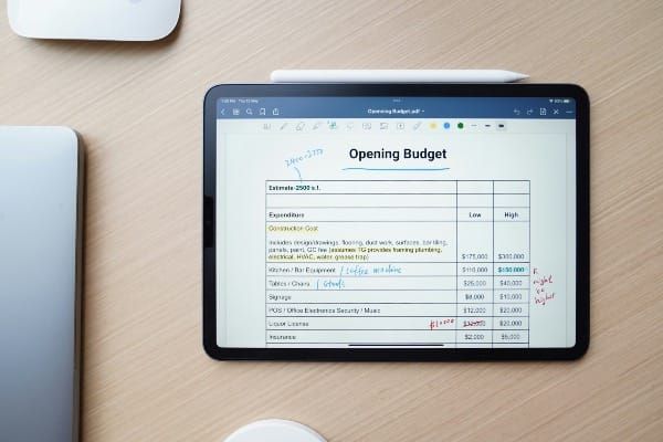
Budget data is one of the most important and most underutilized assets in local government. Every department has an appropriated budget. Every department tracks expenditures. And in most cities, that data sits in an ERP system or finance department spreadsheet — accessible to accountants, invisible to department heads, and entirely opaque to the residents whose tax dollars it represents.
A budget transparency dashboard changes all three of those problems simultaneously. Done well, it gives department heads real-time visibility into their spending position, gives finance officers the cross-departmental view they need to make fund allocation decisions, and gives residents and council members a clear and honest picture of how public money is being spent.
This article walks through how to build one — starting with the framework that makes government budget dashboards fundamentally different from private sector financial reporting, and then walking through the practical steps to build a filterable department-level budget dashboard in Excel.
Why Government Budget Dashboards Are Different
The first and most important thing to understand about building a budget transparency dashboard for local government is that the goal is not the same as in a business context.
In a private company, underspending a budget is almost always good — it means costs were controlled and margins improved. In local government, underspending carries its own accountability problem. Funds that were appropriated to serve residents but not spent represent a failure to deliver the services those funds were intended to fund. An appropriations lapse at year end means a department did not accomplish what it planned to accomplish — and in many jurisdictions it means those funds are returned to the general fund rather than rolled forward.
This creates a dual accountability standard that is unique to public finance and that most generic finance dashboard tutorials completely miss: a government's budget reflects its vision, strategy, and priorities — and a department that consistently underspends is failing to execute on that vision just as surely as one that overspends. Governing
The practical implication for dashboard design is that a local government budget dashboard needs to show both directions of variance — over budget and under budget — as meaningful signals requiring management attention. A department at 95% of budget in month eleven is doing well. A department at 40% of budget in month eleven likely has a problem worth investigating, whether that is delayed projects, unfilled positions, or unplanned scope changes.
The strongest dashboards combine clear context, focused KPIs, and consistent updates to make complex government performance data easy for residents to understand. Dashboards should explain what the data means, not just show it. Fewer, well-chosen KPIs outperform large metric lists. Transparency includes showing setbacks and delays. Envisio
That principle — transparency includes showing setbacks and delays — is what separates a genuine budget transparency tool from a public relations exercise. A dashboard that only shows departments performing well is a marketing document. A dashboard that shows the full picture, including departments behind on spending or over budget, is a governance tool.
The Three Audiences for a Government Budget Dashboard
Before building anything, define who the dashboard is for — because the answer shapes every design decision.
Department Heads
Department heads need to see their own spending position clearly and quickly. How much of their budget have they spent? What percentage of the fiscal year has elapsed? Are they on track to fully deploy their appropriation by year end? Which line items are running ahead or behind?
For this audience the dashboard should be filterable by department so each director sees their own data without wading through citywide numbers. The most useful view is a simple comparison — budget versus actual, by month and by line item — with a visual indicator of whether each line item is tracking within an acceptable range.
Finance Officers and Accountants
Finance officers need the cross-departmental view. Their question is not whether a single department is on track — it is how the city's overall financial position is developing and where there is flexibility to move funds if needed. A department running significantly under budget late in the fiscal year may have funds that can be reallocated to a department facing an unexpected expenditure.
For this audience the dashboard should show all departments simultaneously, with the ability to drill down into any single department for detail. The most useful view is a citywide summary showing each department's budget, actual spending to date, remaining budget, and percentage of year elapsed — so at a glance a finance officer can see which departments need attention.
Council Members and Residents
Council members and the public need simplicity and context. They are not reading line item detail — they want to know whether the city is managing its budget responsibly and whether specific programs they care about are being funded as promised.
The public has a right to know how money is allocated and how it is spent. Making budgets open to public input and scrutiny can help ensure that government planning and spending align with public priorities. Open Government Partnership
For this audience a public-facing dashboard should show departmental spending at a summary level with plain language labels — not account codes — and should be updated regularly enough to remain meaningful. Consistent updates build credibility. Simple, accessible design increases public use. Envisio
The Five Key Metrics for a Government Budget Dashboard
1. Budget vs. Actual Variance
The core metric of any budget dashboard. For each department and each line item, show the appropriated budget, the actual expenditure to date, and the variance — both in dollars and as a percentage. Color code the variance: green for within acceptable range, yellow for approaching threshold, red for over budget or significantly under budget relative to elapsed time.
2. Percent of Budget Expended vs. Percent of Fiscal Year Elapsed
This is the metric your instinct for government finance correctly identified as essential. A department that has spent 60% of its budget with 60% of the fiscal year elapsed is on track. A department that has spent 20% of its budget with 60% of the year elapsed needs attention — not because it is over budget, but because it is at risk of a significant year-end lapse or a dangerous spending rush in the final quarter.
This ratio is more useful than raw spending figures because it accounts for timing. Some departments front-load expenditures because of seasonal work patterns. Others have expenditures concentrated in specific months. Comparing spending pace to time elapsed puts every department on a common comparable baseline.
3. Encumbrances and Commitments
Encumbrances are funds that have been committed — through purchase orders, contracts, or other obligations — but not yet paid. In government accounting, the true financial position of a department is not just what has been spent but what has been obligated. A department with $500,000 remaining budget and $450,000 in outstanding encumbrances is effectively almost fully committed, not flush with available funds.
Including encumbrances in your dashboard gives department heads and finance officers a more accurate picture of available budget than expenditure data alone.
4. Fund Transfer Activity
Tracking where funds have been moved between line items or departments during the fiscal year creates a history of the city's in-year budget management decisions. This is both operationally useful — finance officers can see the cumulative effect of transfers on each department's position — and a transparency signal to council and residents that the city's budget management is visible and documented.
5. Year-End Projection
The most forward-looking metric is a simple projection of where each department will end the fiscal year based on current spending pace. If a department has spent 30% of its budget with 50% of the year elapsed, a straight-line projection suggests it will end the year at approximately 60% of budget — a 40% lapse. That projection, visible in October or November, gives leadership time to investigate and intervene rather than discovering the lapse in December when it is too late.
Building Your Budget Dashboard in Excel: Step by Step
The following walkthrough uses Excel — the most universally accessible tool in local government and the one most likely to be available to finance departments without additional software licensing.
Step 1 — Structure Your Raw Data Tab
Create a Raw Data tab with the following columns:
Department, Fund, Account Code, Account Description, Category (Personnel / Operating / Capital), Appropriated Budget, Encumbrances, Expenditures to Date, Prior Year Actual, Fiscal Year Month.
One row per account line per month gives you the granularity needed for both monthly trend analysis and year-to-date summaries. This structure mirrors what most government ERP systems export — which means your finance team can paste updated data monthly with minimal reformatting.
Step 2 — Build Your Summary Calculations
On a separate Calculations tab, use SUMIF formulas to roll up your raw data by department:
Total Budget by Department:
=SUMIF(RawData[Department], DeptName, RawData[Appropriated Budget])

Total Expenditures by Department:
=SUMIF(RawData[Department], DeptName, RawData[Expenditures to Date])

Variance:
=Total Budget - Total Expenditures

Percent Expended:
=Total Expenditures / Total Budget
Step 3 — Create Your Department Filter
Add a Data Validation dropdown cell at the top of your Dashboard tab. List all department names as the validation source. Every formula on your dashboard tab should reference this cell as a filter — so when a user selects Public Works, every chart and KPI card updates to show only Public Works data.
This is the feature that makes your dashboard genuinely useful to department heads rather than just finance officers. Each director can open the file, select their department, and immediately see their own position without navigating through citywide data that does not concern them.
Step 4 — Build Your KPI Cards
Four KPI cards on the Dashboard tab give department heads their headline numbers at a glance:
- Total Appropriated Budget — the approved spending authority for the selected department
- Expenditures to Date — actual spending through the current period
- Remaining Budget — appropriated minus expended minus encumbrances
- Percent of Year Elapsed vs Percent Expended — the comparison metric that drives the most useful conversations
Format these as large, clearly labeled cells with conditional color formatting — green when spending pace aligns with time elapsed, yellow when variance exceeds 10 percentage points, red when variance exceeds 20 percentage points or when the department is over budget.
Step 5 — Add a Monthly Trend Chart
A bar or line chart showing monthly expenditures against a monthly budget target gives department heads a visual rhythm of their spending — easy to spot months where spending was unusually high or low, and easy to see whether the overall trend is tracking toward a year-end surplus or lapse.
Step 6 — Add a Line Item Detail Table
Below the KPI cards and trend chart, a filterable table showing each account line item — with budget, encumbrance, expenditure, remaining balance, and percent expended — gives finance officers and department heads the drill-down detail they need when a headline number raises a question.
What Makes a Budget Dashboard Genuinely Transparent
Building the dashboard is the technical work. Making it genuinely transparent is the organizational work — and it is harder.
The presentation of budget information should take account of the needs of different users and be presented in an accessible format. That means different versions or views for different audiences — the internal management dashboard used by finance and department heads does not need to be the same as the public-facing summary presented to council or posted on the city website. OECD
Genuine transparency also means updating regularly and consistently. A budget dashboard updated once a year is a budget report. A dashboard updated monthly is a management tool. A dashboard updated weekly is a governance capability. The update frequency should match the decision-making rhythm of the people using it — and it should be honest about the data's currency every time it is viewed.
Having a publicly available government dashboard is one of the best ways that local governments can build trust with the community and elected officials while engaging employees. The trust benefit comes not from showing that everything is going well — it comes from showing the complete picture, including challenges, consistently and without spin. Envisio
Final Thoughts
A budget transparency dashboard is not a technology project. It is a governance commitment expressed through technology. The Excel workbook, the PowerBI report, or the public-facing web dashboard are all just delivery mechanisms for a more fundamental decision: to make the city's financial position visible, honest, and accessible to the people who need to see it.
Department heads who can see their own position in real time make better spending decisions. Finance officers who can see the citywide picture can manage fund balances more effectively. Council members and residents who can see how appropriated funds are being deployed have the information they need to hold their government accountable.
The data already exists in your ERP system. The formulas are straightforward. The barrier is not technical — it is the organizational decision to build something, update it consistently, and share it honestly.
That decision is worth making.
Ready to build dashboards for your department?
The Local Government Dashboard Template Pack includes three Excel dashboards built specifically for city analysts and utility managers — call center performance, utility billing, and public works service requests. Each template comes pre-loaded with fictional data so you can see it working immediately.